One Kings Lane
One-click Checkout
One-click Checkout
A redesign that led to a 10% increase in completion rates.

One Kings Lane is a luxury home decor online store.
I joined the newly created Product Design team in 2017, right after One Kings Lane’s acquisition by a Fortune 500 company. In that small and nimble team, I was responsible for the crucial back of the customer funnel (Cart, Checkout, Order Management), as well as developing brand new features and landing pages.
I also got to contribute to our Product Design language, mentor young designers, and lead research and usability testing sessions.
The Challenge
Business problem
After a replatform of the One Kings Lane site, including UI and UX changes to the Checkout funnel, the new experience was underperforming. Drop-off rates were increasing, impacting conversion.
Business goal
Our goal was to bring the new checkout funnel up to par with the previous version and improve completion rates.
User problem
The checkout experience was cumbersome,
User goal
-
Reduce friction
-
Streamline the process to only 1 step for returning users
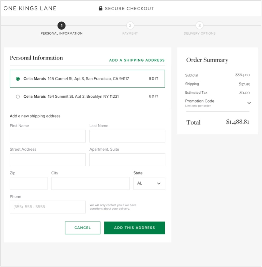
Our goal was to minimize friction by reducing the number of required steps. Currently, returning users had to go through 7 steps, which we recognized as a problem based on competitive analysis.
Despite limitations in our platform, our objective was to streamline the checkout process to just one step for returning users.
Understand
- Competitive research
- Usability data and heatmaps
- Customer service calls
Findings
Users don’t now where to go and what to do next.
The different sections weren’t numbered.
Hypothesis: Create clear goalposts and information architecture.
Our patterns were different and unusual compared to industry best practive
For eg: the billing address came before the shipping address, which was unusual and not very intuitive.
Hypothesis:
Aligning with industry best practices will reduce cognitive load, making the experience familiar and easy.
The process is long and onerous
Most successful checkout experiences had 3 or 4 steps, with one-click options for returning users.
"Rage clicking" was observed, indicating confusion among users regarding the next steps.
Our hypotheses for solving each pain point:
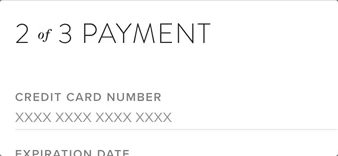
Many calls were related to returns and delivery, leading to the inclusion of relevant information and best practices such as auto-formatting in the credit card field.Goalposts and clearer information hierarchy needed to address user confusion and provide guidance.
Streamlining steps, such as merging delivery options into a single section, to minimize the overall number of required steps.
Numbering sections to improve clarity and user navigation.
Competitive research
- Most (good) checkout experiences contained around 3 or 4 steps, and the best ones were a one-click experience for returning users who didn’t need to add a shipping address or payment method. Drive growth, increase transactions and gross merchandise value.
- Enable faster development through a unified component system.
Identifying and understanding current pain points
-
Customer service calls: For example, a lot of the calls to customer service were about returns and delivery, so we surfaced that information. We also added very simple best practices - like auto-formatting in the credit card field.
- Next, we took a deeper look at our usability data, heatmaps, and took a look at some sessions recording. That showed us that many people were tapping or clicking disabled buttons multiple times - “rage clicking”.
Hypothesis
Immediate improvements
We wanted to move fast, so we decided to start with a few small improvements to the existing page that could be implemented quickly while we took a deeper dive into the data - low hanging fruits that we knew were a problem.
- For example, a lot of the calls to customer service were about returns and delivery, so we surfaced that information.
- We also added very simple best practices - like auto-formatting in the credit card field.
This led to a drop in customer support calls, and fewer errors on the credit cart field. Already, a customer experience and operational improvement.
Ideation
Completing checkout requires a lot of information from the user, and is actually quite a complex flow.
How might we...
- Reduce remove, or merge steps?
- Only surface information we absolutely need?
- Strip down the number of decisions a customer needs to make?
- Optimize for the largest number of users and the most frequent actions?
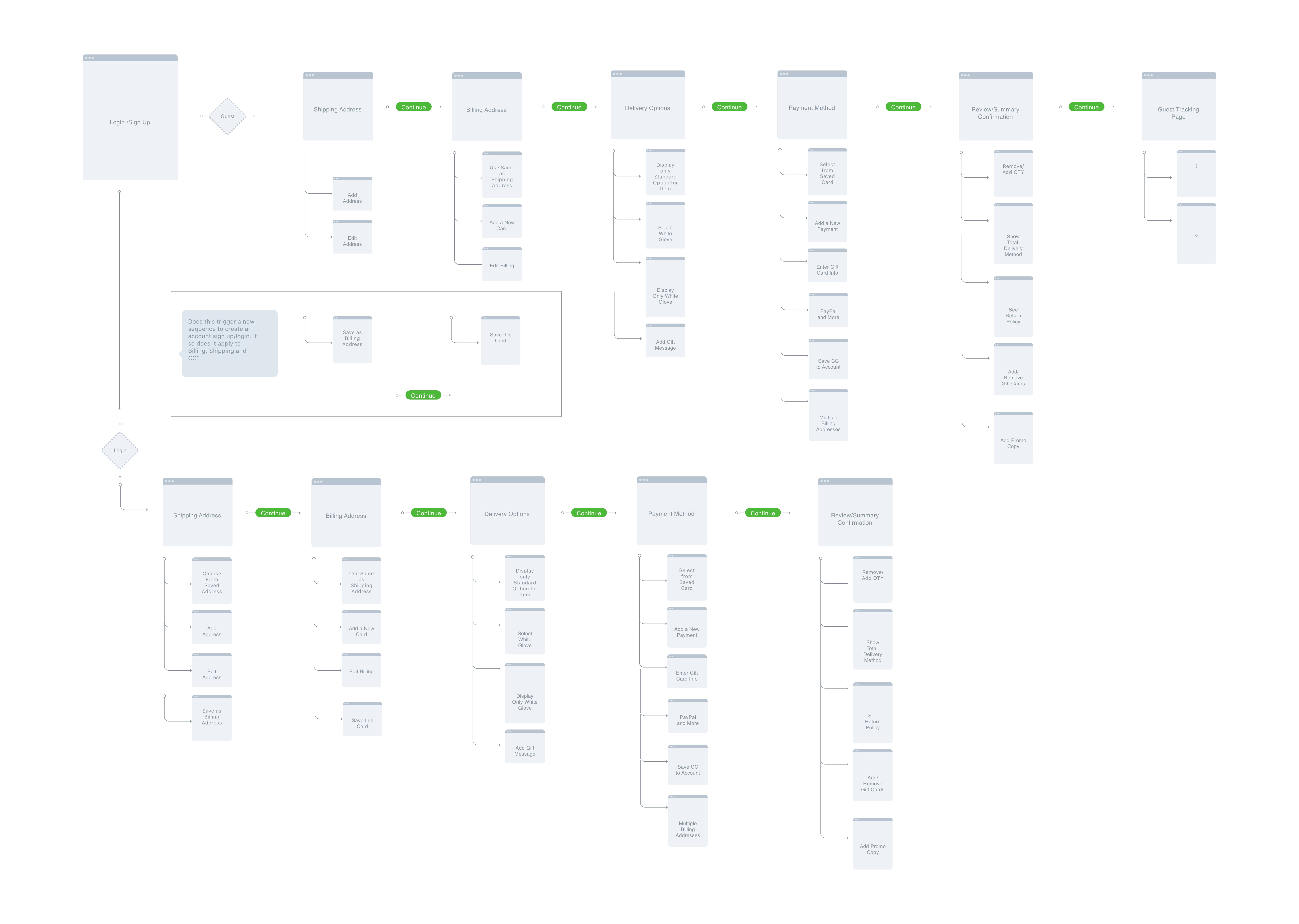
Iterations and testing
Extensive paper sketching and testing with lo-fi mockups
Iterate different patterns and layouts.
-
Should we have a stepped process?
-
Should editing shipping and payment information happen inline, or in a modal?
Validating decisions
Usability testing, and this gave us enough information to start making decisions and move on to the final design.
Final Design
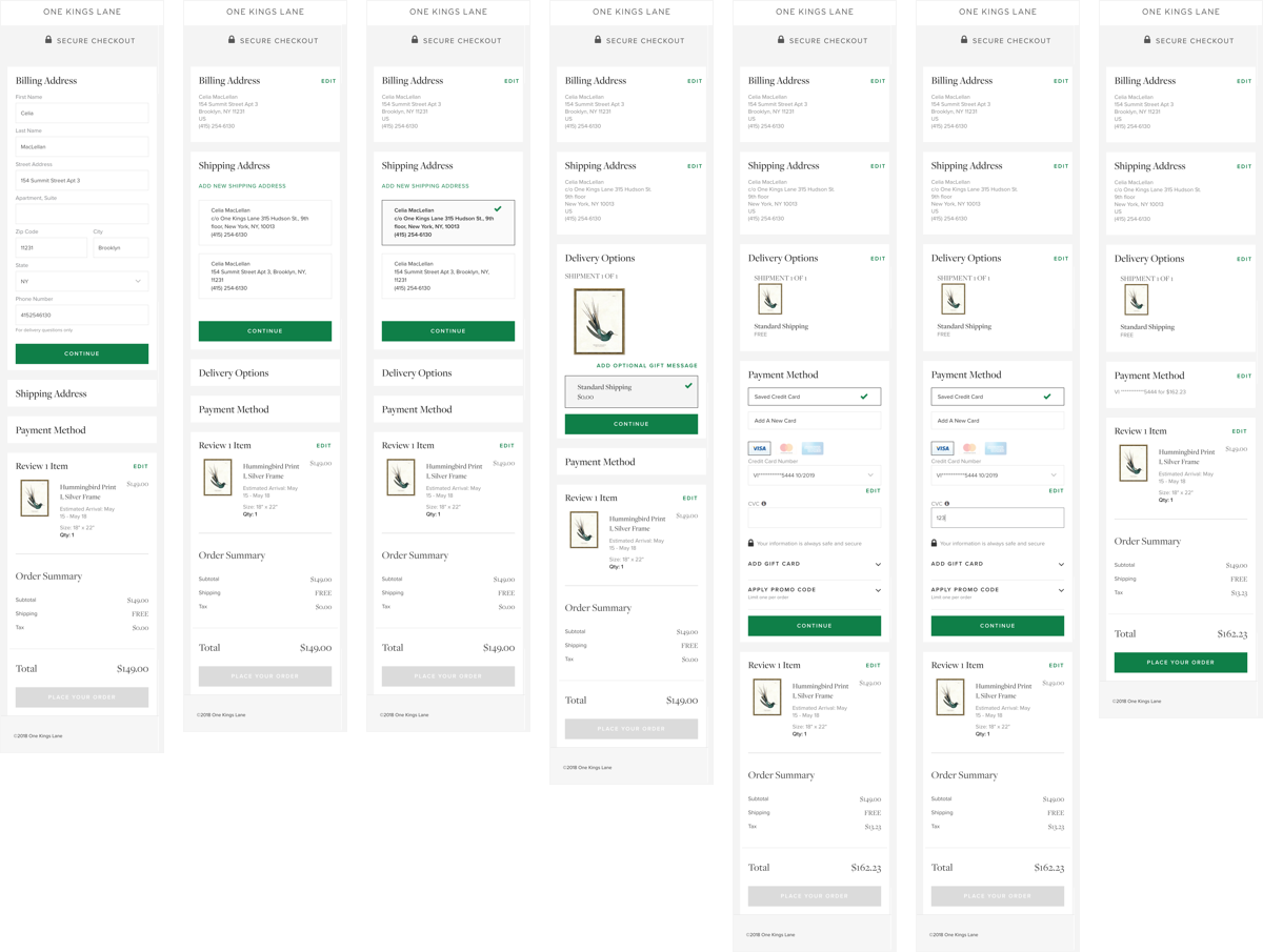
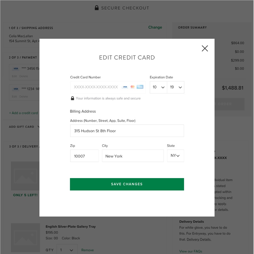
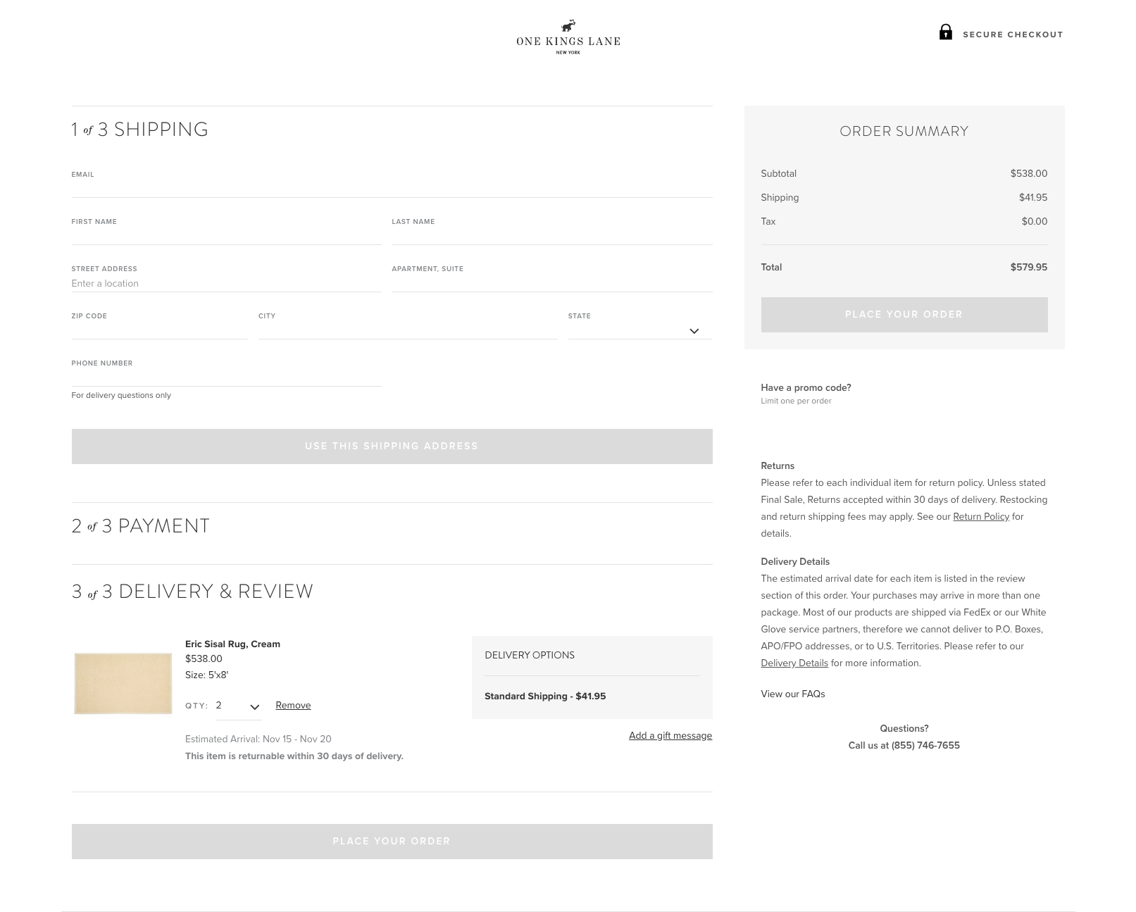
We collapsed the order review and shipping method sections. We removed the billing section, asking instead for billing information when they entered their payment.
We established clear goalposts, numbering the sections, and reducing the overall form height. Number of step aWe collapsed the order review and shipping method sections. We removed the billing section, asking instead for billing information when they entered their payment.
We helped users focus on the task at hand by collapsing any completed or inactive sections, and making each step inaccessible until the preceding one had been completed. Goalpost
We established clear goalposts, numbering the sections, and reducing the overall form height. We helped users focus on the task at hand by collapsing any completed or inactive sections, and making each step inaccessible until the preceding one had been completed.
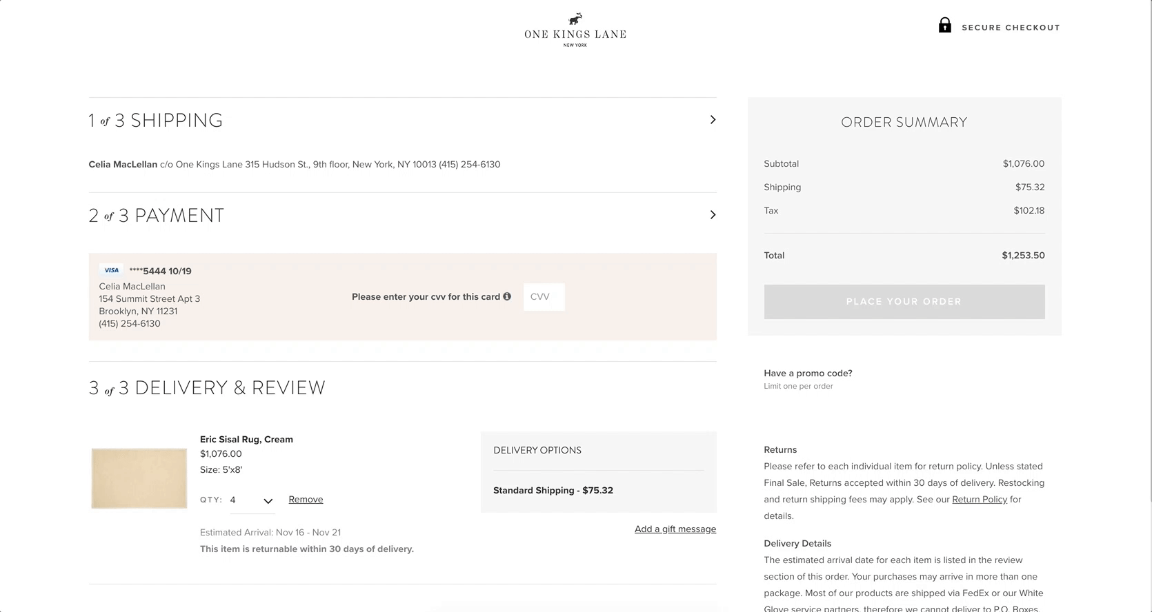
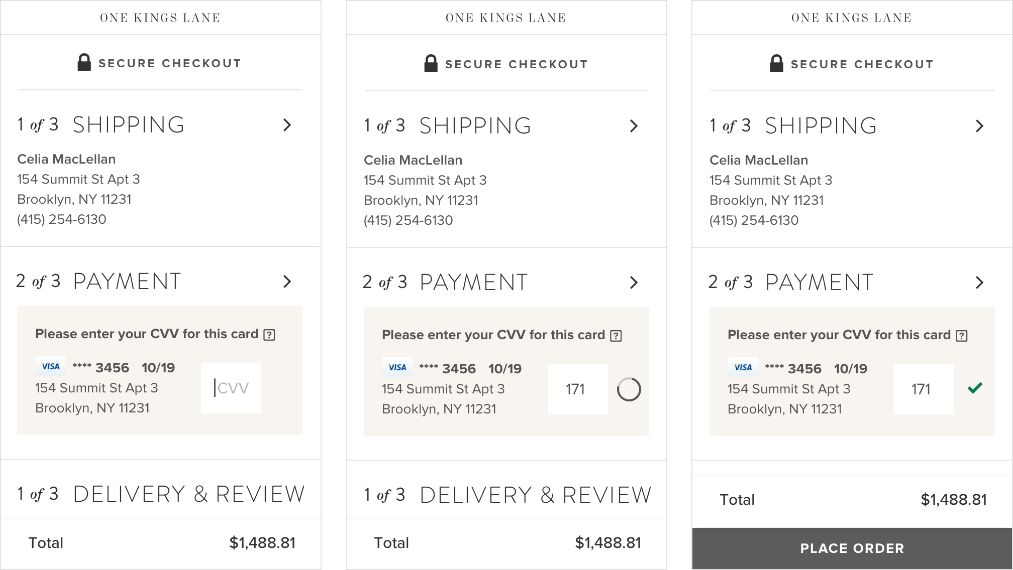
Returning user
Optimizing for most frequent valuable use case: returning users
and that most had only one payment method and shipping address on file. So we decided to default to the last used shipping address and payment method if a customer was returning, and collapsed those sections upon landing.This allowed us to minimize the information needed - down only their credit card CVV - allowing buyers to checkout in one click.
Outcomes
A streamlined, easier, and straightforward experience for new and guest users, a one-click checkout for our returning customers, and a 10% increase in the number of users landing on the checkout page who completed their purchase.

Most recently on the Commerce team at Meta in New York. Formerly at mental health startup Spring Health and luxury furniture retailer One Kings Lane. Before that, I worked on short films, music videos, and visual design in Montreal.