Spring Health
Mindfulness App
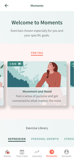
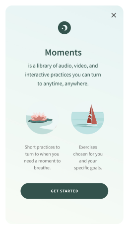
A library of guided digital CBT* and mindfulness exercises for the Spring Health app, which led to an 136% increase in app downloads, became a “wow” moment for the brand and received overwhelmingly positive feedback from users and HR leaders alike.
“This feels nice and peaceful and clear, other companies don’t have that.”
* Cognitive Behavioral Therapy (CBT) is a type of psychotherapeutic treatment that helps people learn how to identify and change destructive or disturbing thought patterns that have a negative influence on behavior and emotions.
Spring Health offers a mental health benefit and uses data to help predict the right treatment to the right person at the right time, ultimately accelerating recovery.
I was the first design hire at this hyper-growth company that went from about 30 employees to over 100 in less than 18 months.
As the sole designer, I helped launch the mobile app, redesigned the account creation flow (amongst other things), which lead to a significant growth in people entering care.
The Challenge
My role
Led and executed all aspects of this project: Research, UX and UI Design, Usability Testing, Prototyping
The business problem
Spring Health needed to widen its offering. While offering access to a network of world-class providers, it wasn’t addressing the needs of lower acuity patients, who may not want therapy, but still need help managing their everyday mental health.
The user problem
Using existing content, and within a very narrow scope and a fast timeline, how can we give users a path to the exercises that will be most helpful to them, without being able to truly customize the experience to their condition?
The hypothesis
Adding a library of CBT and mindfulness exercises to our mobile app would make us more competitive, and increase the number of patients we reach.
Goals and Constraints
Integrate newly acquired IP (a content library of proven, self-guided, interactive CBT exercises) to Spring Health’s existing iOS and Android app.
Constraints
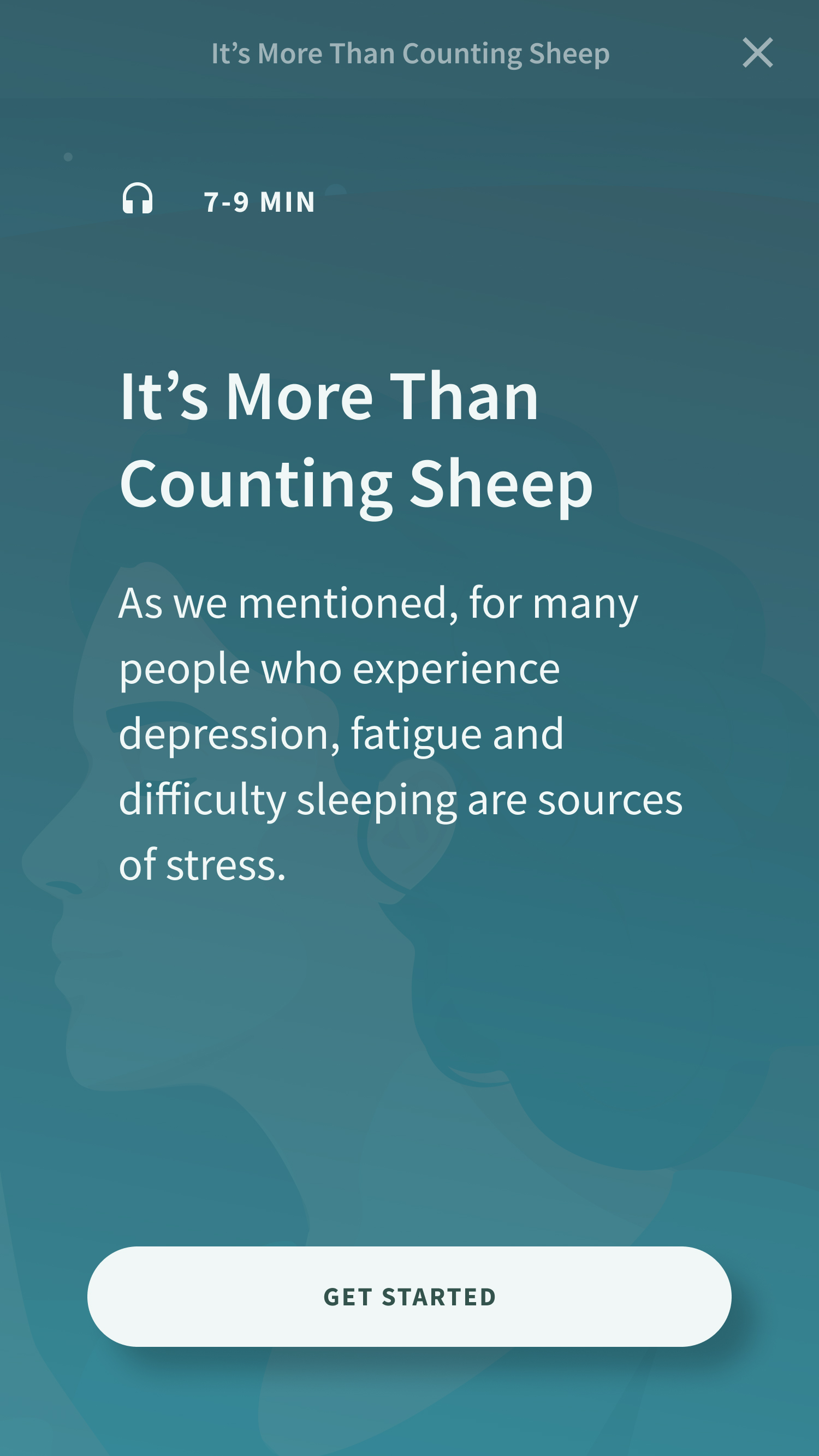
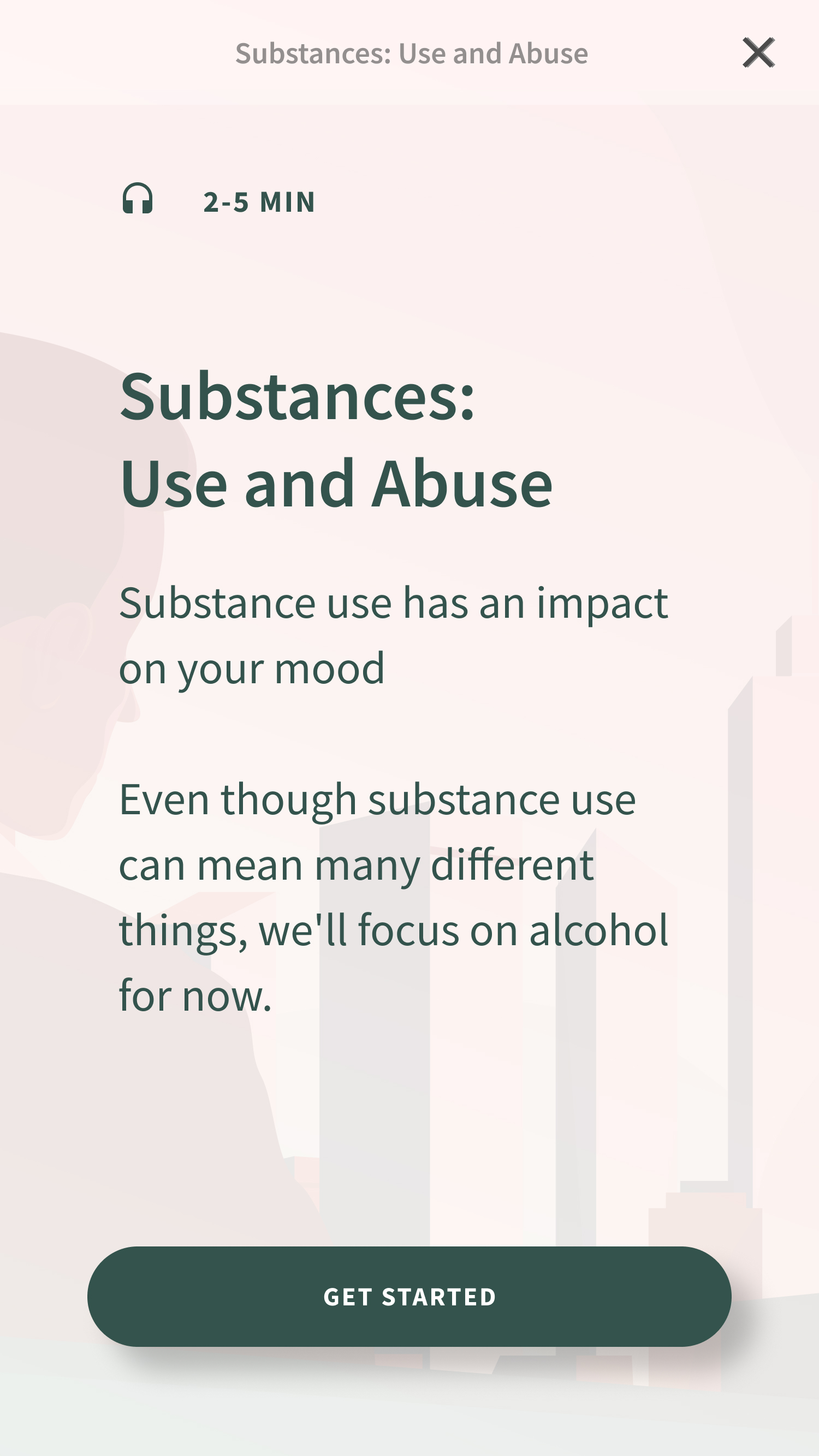
- Pre-determined, text-heavy content
- Phased releases, with only a limited number of exercises available at first
- The compressed timeline did not allow for user research during the discovery
- We would not be able to tailor to user’s specific condition or diagnosis
Goals
- Give immediate help to users who may find themselves in crisis or in a stressful situation
- Make the exercises digestible despite of sometimes text-heavy content
- Make our offering appear deep and broad
How might we...
Help users find the exercises that will be most helpful to them, without knowing anything about their condition?
Ideation
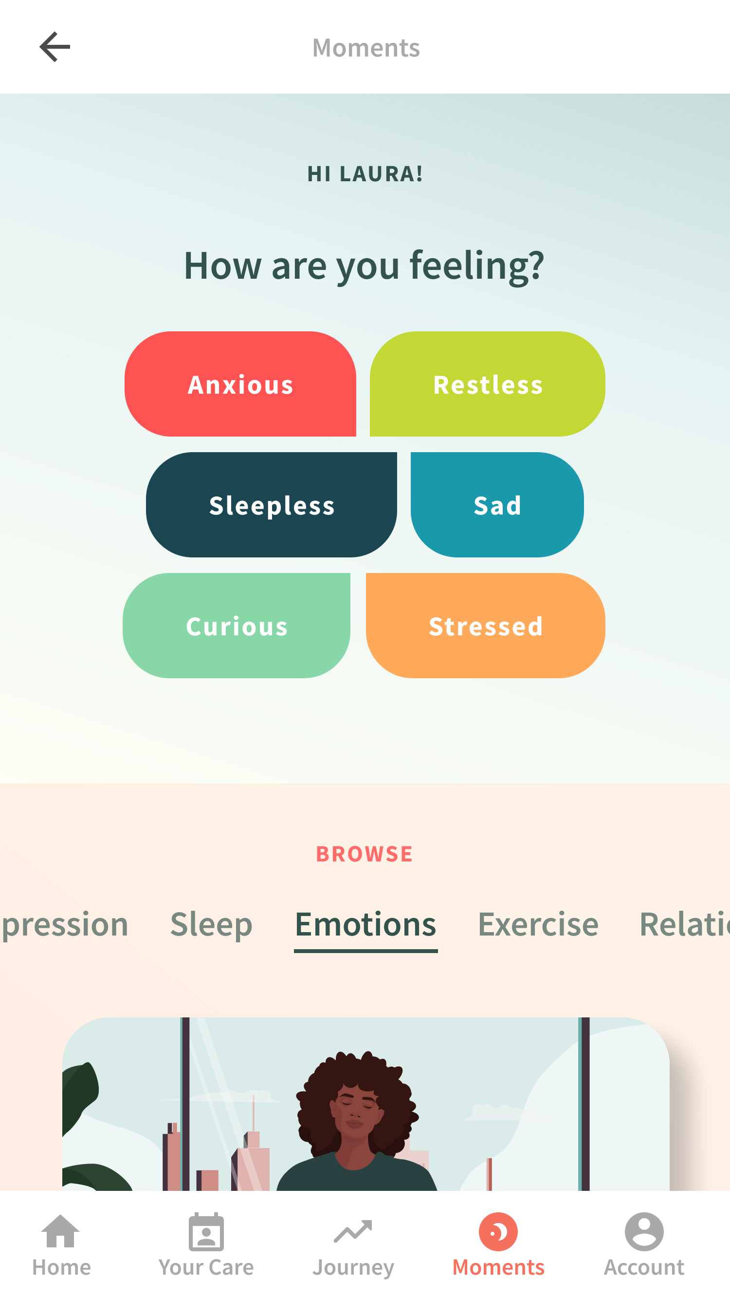
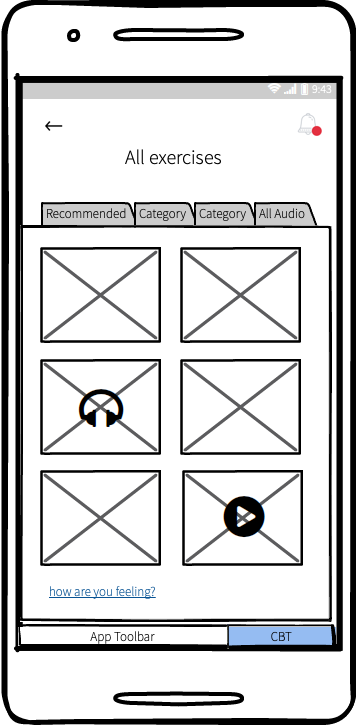
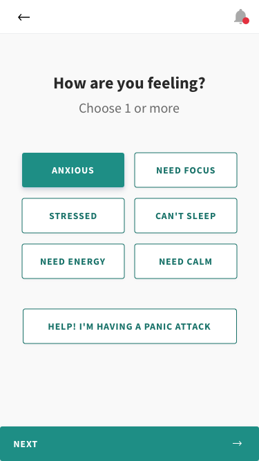
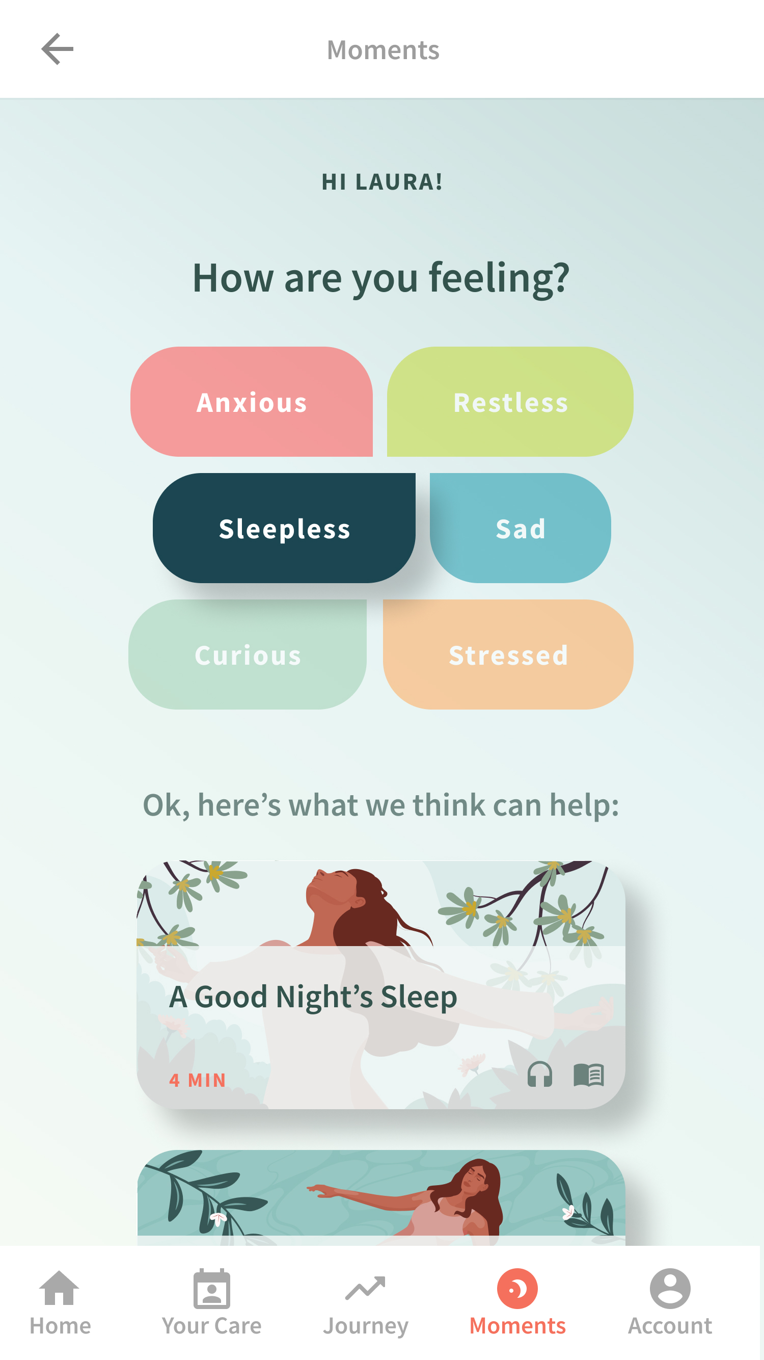
Exercises were already organized around specific themes of issues. I thought we might be able to leverage this existing nomenclature of exercises.
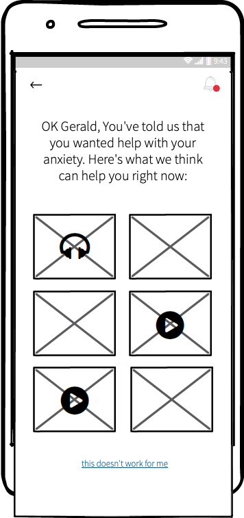
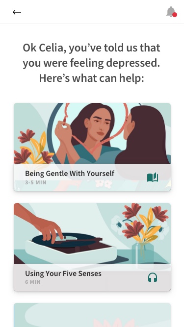
Why not ask users how they feel in the moment, and match their answers to different categories of exercises?
The Hypothesis
By asking users how they feel instead of asking them to dive into our content, they will be able to find the relief they need easily and more rapidly.
Also, mapping the user’s current emotional state to existing categories, we wouldn’t need any sweeping backend change.
We believed this would make experience personal and as impactful as possible without largely expanding scope.
Wireframing and Testing
Usability study
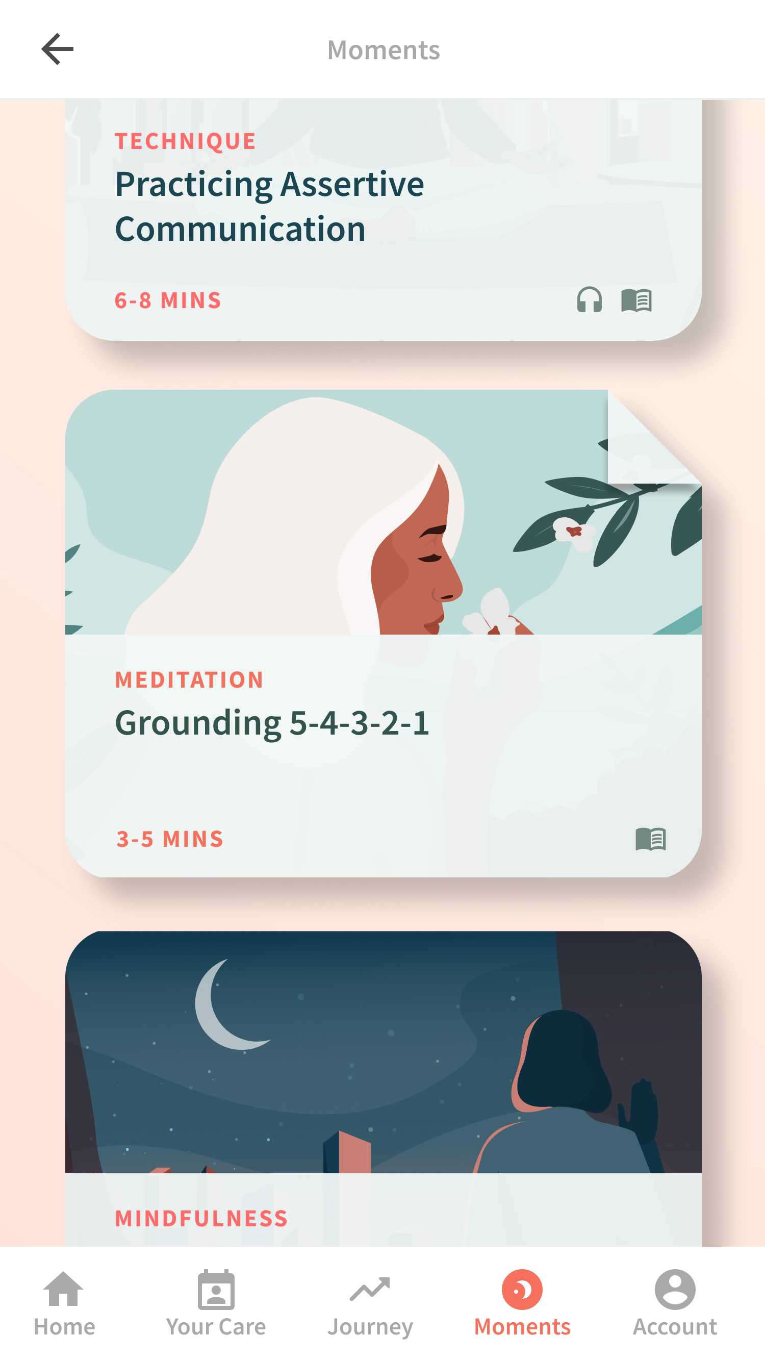
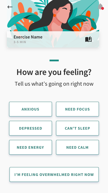
We then went to testing, and that led us to make a few improvements. Our main feedback was that some users weren’t clear on how to switch between the library and the emotion menu. So we decided to merge them into one screen.
We then went to testing, and that led us to make a few improvements. Our main feedback was that some users weren’t clear on how to switch between the library and the emotion menu. So we decided to merge them into one screen.
Visual Design
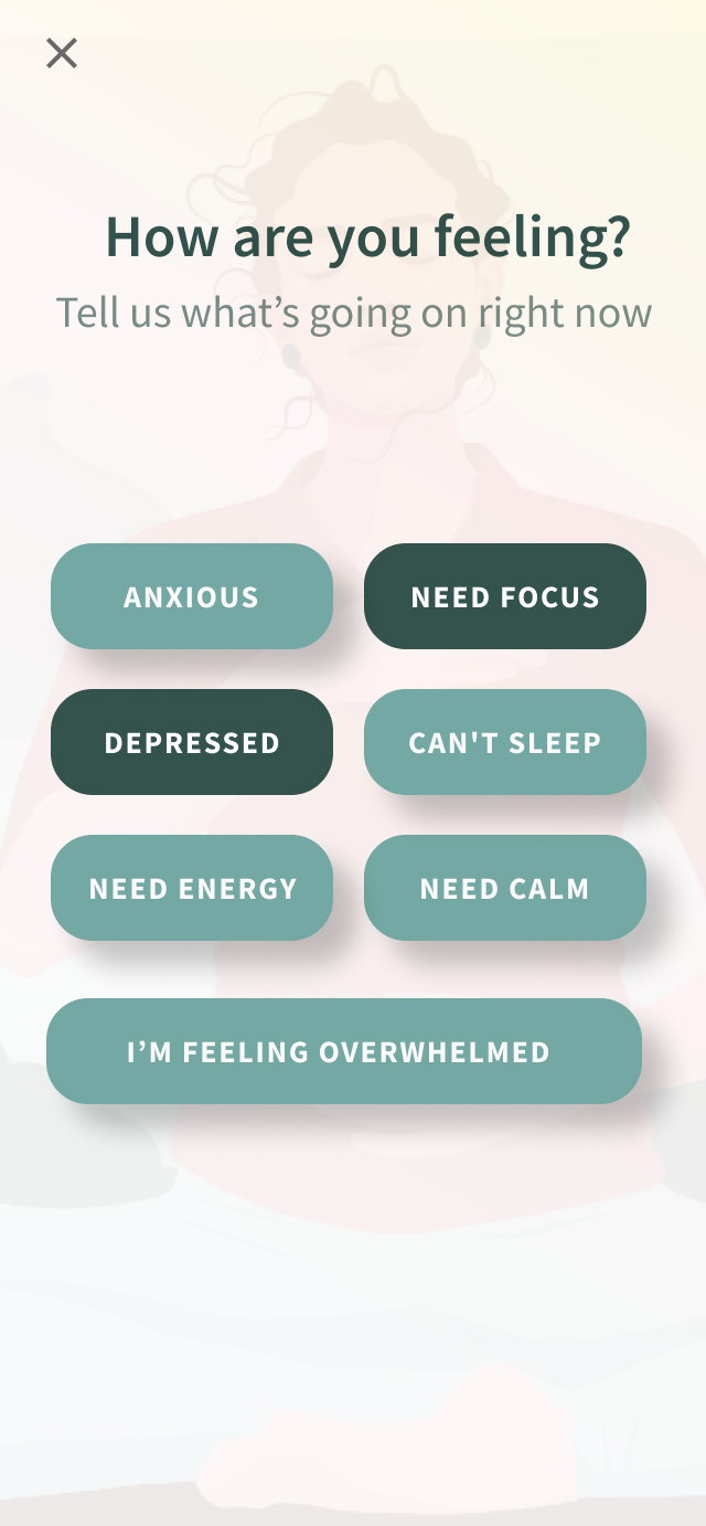
Rapid iterations
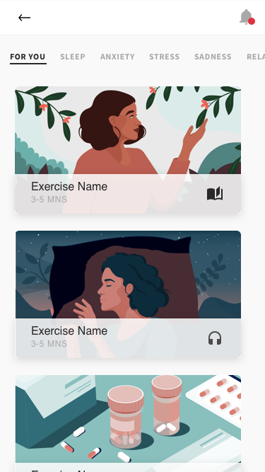
Final screens
Layout and Colors
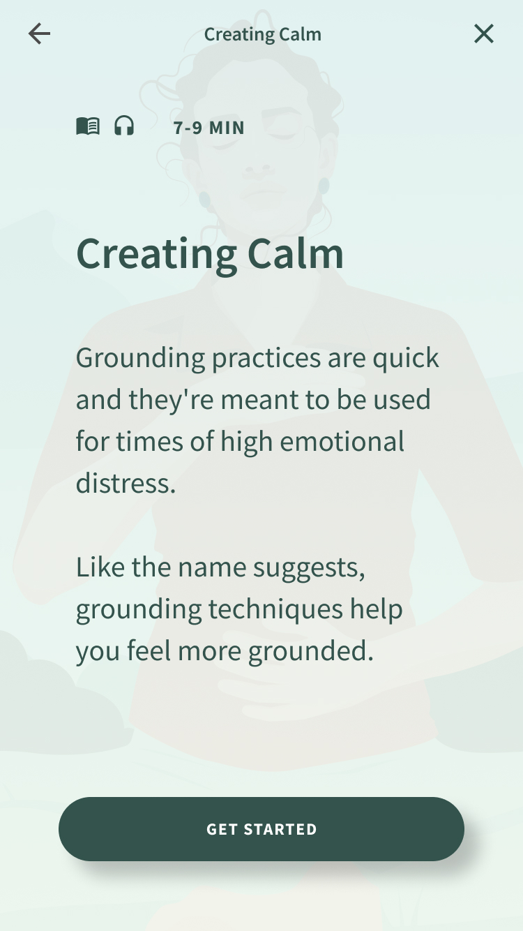
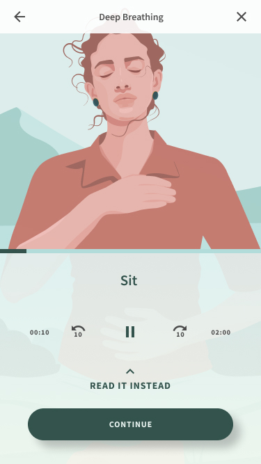
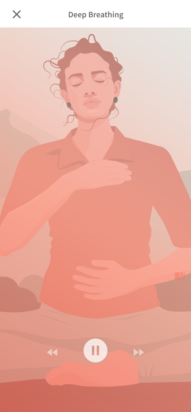
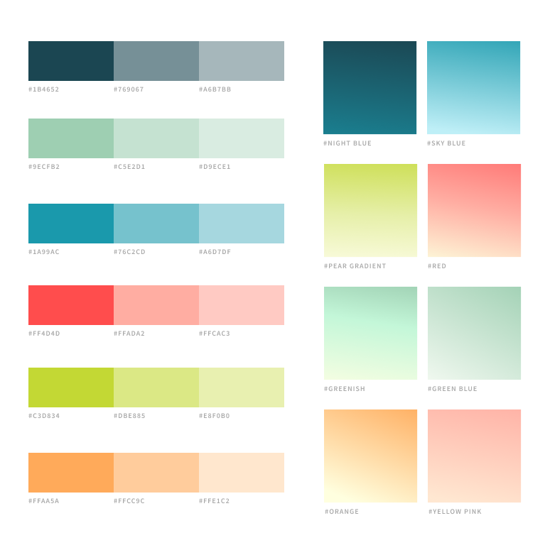
General principles of color theory were used to convey peacefulness and calm, with input from the clinical team to ensure make sure we were communicating the right emotions. Each exercise draws from a different color palette for its typography, background, buttons, and icons.


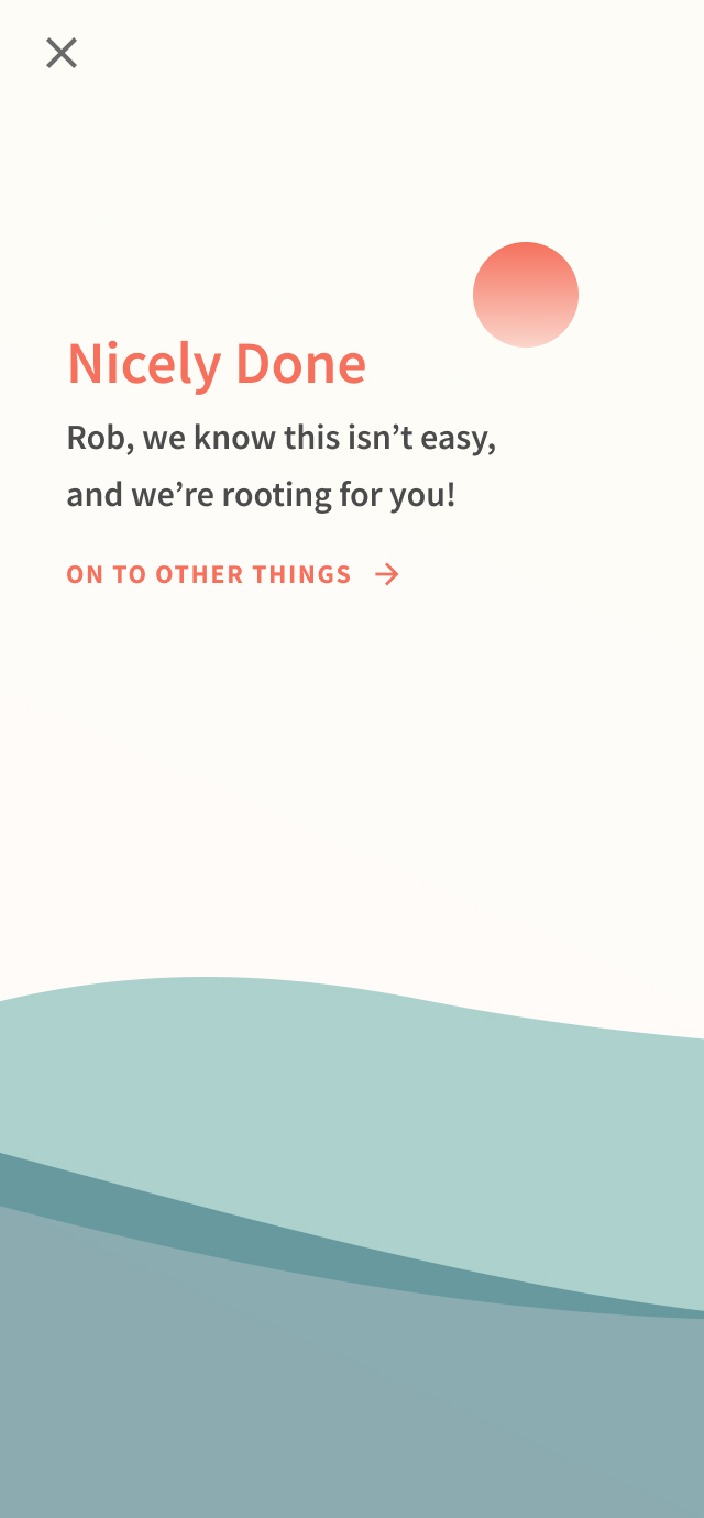
Animated transitions upon completing an exercise
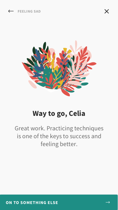
Upon completing an exercise, users are presented with a few words of congratulation and a short celebratory animation.
Upon completing an exercise, users are presented with a few words of congratulation and a short celebratory animation.
Outcome
After adding Moments, the number of downloads of Spring Health’s mobile app jumped 136%. The library exercises became a “wow” moment for our brand, and had a small part to play in Spring Health’s exponential growth and received overwhelmingly positive feedback from users and HR leaders alike.
“This app is amazing! It was extremely easy to navigate, very problem-solution focused, and easy to understand even without previous knowledge of the subject matter.”
- Patient quote
“This feels nice and peaceful and clear, other companies don’t have that.
- HR leader quote

Most recently on the Commerce team at Meta in New York. Formerly at mental health startup Spring Health and luxury furniture retailer One Kings Lane. Before that, I worked on short films, music videos, and visual design in Montreal.